

Jon Campbell / Stephen Bush, Tone Deaf, acrylic and oil paint, linen. 150 x 150 cm, 2020.
Photo: Brigid Moriarty
jon campbell,
ARTIST
January, 29th 2021
ENG
Jon was born in Belfast, Northern Ireland and migrated with his family to Australia in 1964. He studied painting at the Royal Melbourne Institute of Technology 1980-82 then postgraduate painting studies at The Victorian College of the Arts 1984-85.
Jon has been a constant fixture on the Australian art scene since he first began exhibiting paintings of suburban youth culture in the 1980s. Since then his practice has evolved to become one of the more complex examples of Australian Pop Art.
Campbell’s masterfully realised paintings, cutouts, banners, neon’s, flags and songs demonstrate his love of suburbia and its vernacular. His works define not only the look of the world in which Campbell lives, but the accent and humour of its language.
Jon lives and works in Coburg, Melbourne. He is represented by Darren Knight Gallery, Sydney.
ITA
Jon Campbell è nato a Belfast (Irlanda del Nord) ed è emigrato con la sua famiglia in Australia nel 1964. Ha studiato pittura al Royal Melbourne Institute of Technology (1980-82), ha poi compiuto studi post-laurea di pittura al Victorian College of the Arts (1984-85). Jon è stato una presenza costante nella scena artistica australiana, sin da quando ha iniziato a esporre dipinti sulla cultura giovanile delle periferie, negli anni '80. Da allora la sua pratica si è evoluta fino a diventare uno dei più complessi esempi di Pop Art australiana. I dipinti magistralmente realizzati da Campbell, i ritagli, gli striscioni, i neon, le bandiere e le canzoni dimostrano il suo amore per la periferia e per i suoi aspetti vernacolari. Le sue opere descrivono non solo come appare il mondo in cui vive, ma anche l'accento e l'umorismo del suo linguaggio.
Jon vive e lavora a Coburg (Melbourne). È rappresentato da Darren Knight Gallery di Sydney.
ENG
LZ: Slang, signage, clichés, common expressions, slogans. Your text works come from a myriad of sources, being then remade with painting, collage, neon or plywood. What is for you this universe of words sampled from popular culture? Are your latest works going more into the exploration of lettering and the creation of a personal language?
JC: My art has been mainly text based for the last 20 years. It’s an ongoing exploration of the visual potential of words through the use of vernacular language and popular culture. The words celebrate and critique Australian history and culture.
The texts come out of everyday language and highlight aspects of our culture that I feel need to be addressed or commented on. I am always on the lookout for words that resonate with me in a way that helps to articulate the world I live in. They can come from overheard conversations, newspapers, pop songs (I also play in a band and sing and write songs) politicians, sportspeople, etc. They can arrive from anywhere at anytime and have to be written down immediately so as not to be forgotten.
In recent paintings, snippets of conversation, argument and dialogue are transformed using the conventions of formal abstraction and graphic design to both confuse the original function of the words and phrases and elevate them to a pictorial object. The negative spaces around the letters become positive. The viewer becomes part of the work as they unravel the text and say the phrase.
IT
LZ: Slang, segnaletica, cliché, espressioni comuni, slogan. Le tue opere in forma di testo provengono da una miriade di fonti, per essere poi realizzate con la pittura, il collage, il neon o il compensato. Cosa significa per te questo universo di parole campionate dalla cultura popolare? I tuoi ultimi lavori stanno forse andando verso l’esplorazione del lettering e la creazione di un linguaggio personale?
JC: Negli ultimi 20 anni la mia arte si è basata principalmente sul testo. È una continua esplorazione del potenziale visivo delle parole attraverso l'uso del linguaggio vernacolare e della cultura popolare. Le parole celebrano e criticano la storia e la cultura australiana.
I testi nascono dal linguaggio quotidiano ed evidenziano aspetti della nostra cultura che per me hanno bisogno di essere affrontati o commentati. Sono sempre alla ricerca di parole che risuonano in me in un modo che aiuta ad articolare il mondo in cui vivo. Possono provenire da conversazioni ascoltate, giornali, canzoni pop (suono anche in una band, canto e scrivo canzoni), politici, sportivi, ecc. Possono arrivare da qualsiasi luogo e in qualsiasi momento e devono essere scritte immediatamente per non essere dimenticate.
Nei dipinti recenti, frammenti di conversazioni, argomentazioni e dialoghi vengono trasformati usando le convenzioni dell'astrazione formale e del graphic design, sia per confondere la funzione originale delle parole e delle frasi che per elevarle a oggetto pittorico. Gli spazi negativi intorno alle lettere diventano positivi.
Lo spettatore diventa parte dell'opera mentre dipana il testo e pronuncia la frase.

Stacks On, 12 lightboxes in 3 stacks, aluminium, 2 pac enamel spray paint, acrylic, vinyl faces, 12 screen-printed hand stitched banners, water-based printing ink, cotton, linen, damask and towelling. Install view, MCA, 2017.
Collection MCA - Museum of Contemporary Art, gift of the Melbourne Art Foundation (Melbourne Art Foundation Commission 2010) and part purchase supported by the Coe and Mordant families, 2010.
Photo: Anne Kucera

Rollercoaster, acrylic paint, linen, 46 x 31 cm, 2018.
Photo: Tobias Titz
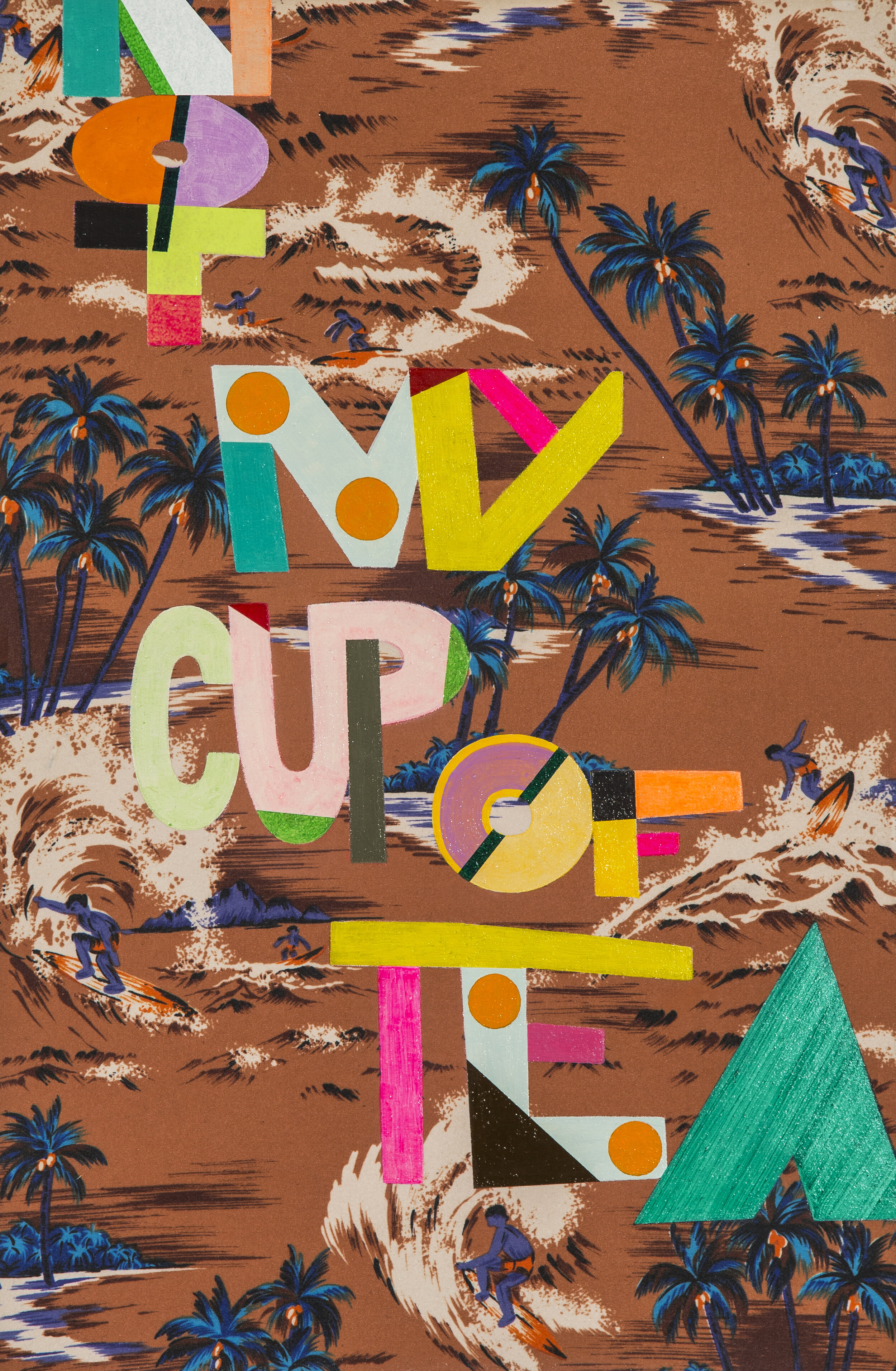
Not my cup of tea, acrylic paint, cotton surf shirt, mdf board, 45 x 29.5 cm, 2018.
Photo: Tobias Titz

Dunno (T.Towels), mixed media, cotton, linen, 85 pieces, 4.2 x 8.5 metres irregular, 2012.
Installation view, Melbourne Now, National Gallery of Victoria.
Photo: Jon Campbell
ENG
LZ: Your found texts are sometimes painted, printed or collaged onto found fabrics. How do you choose the fabric and how do you deal with the overlapping of these two layers of meaning?
JC: My use of fabric falls into two categories, commercial cotton or linen and used/second hand fabrics found in opportunity shops and vintage stores. Some of the T.Towels are nearly fifty years old. The commercial fabrics are usually stretched over cedar stretchers then painted on.
The fabric is integral to the look, feel and finish of the artworks, whether it is paintings or screen-prints. The ‘found’ fabrics come with their own history and add another layer of meaning to the works. The familiarity of the textiles past life gives the viewer a way into the work as they recognize fabrics and patterns that remind them of home furnishings, curtains, bed spreads, tablecloths and their own histories. This then allows the viewer to engage with the subject matter (words and sayings).
There is no plan as to what words go onto what fabrics; it’s a very intuitive response. For example a band flyer from a gig in the late 70’s in Sydney is screen-printed onto a toweling bedspread complete with tassels. The words highlight the fabric and the fabric highlights the words. It’s this unique combination that creates the visual interest.
IT
LZ: I tuoi testi “trovati” sono a volte dipinti, stampati o assemblati a collage su tessuti “trovati”. Come scegli il tessuto e come gestisci la sovrapposizione di questi due livelli di significato?
JC: Il mio utilizzo del tessuto rientra in due categorie: cotone o lino commerciale e tessuti usati/di seconda mano trovati nei negozi dell'usato o vintage. Alcuni canovacci hanno quasi cinquant'anni. I tessuti commerciali vengono di solito montati su telai in legno di cedro e poi dipinti.
Il tessuto è parte integrante dell'aspetto, della sensazione e della finitura delle opere d'arte, che si tratti di dipinti o serigrafie. I tessuti "trovati" hanno una loro storia e aggiungono un altro strato di significato alle opere.
La familiarità che lo spettatore percepisce nei confronti della vita passata dei tessuti gli fornisce un modo per entrare nell'opera, soprattutto quando riconosce i tessuti e i motivi decorativi che gli ricordano i mobili di casa, le tende, le coperte, le tovaglie, con tutte le loro storie annesse. Questo permette allo spettatore di dedicarsi al soggetto (alle parole e ai modi di dire).
Non c'è un’intenzione che determina quali parole debbano andare su quali tessuti, è una cosa molto intuitiva. Per esempio, un volantino di un concerto di una band della fine degli anni '70 a Sydney è serigrafato su un copriletto di spugna con delle nappe. Le parole evidenziano il tessuto e il tessuto evidenzia le parole. È proprio questa combinazione unica che crea dell'interesse da un punto di vista visivo.
ENG
LZ: What's the story behind the yeah flag?
JC: The yeah flag project started when I was invited to make a flag for an exhibition called ahoy in Hamilton New Zealand. It was a public art project utilizing two flagpoles in downtown Hamilton organized by Warren Olds and Nicola Farquhar. “yeah” was a way of including everyday language in my work, given that I say “yeah” about 500 times a day! I thought it would be cool to look up and see “yeah” on a flag rather than the generally boring national flag designs or advertising material. In addition, the colours, pink and green, were not the usual colours found on flags.
When I received an image of the yeah flag flying in Hamilton I decided to re-make it as an edition. I contacted my friend Stewart Russell who runs Spacecraft, the fabric screen-printing studio in Melbourne as he had made flags previously and he organized for the flags to be hand sewn by textile artist Jeanette Mayne, who he had made contact with through the Country Women’s Association, an organization known for its craft skills.
Upon seeing the yeah flag flying, “A Constructed World” (collaborative project founded by Geoff Lowe & Jacqueline Riva) proposed the idea as an art project, with a petition to make the yeah flag the new Australian flag. We launched the petition with a joint exhibition at Uplands Gallery in Melbourne 2005. With a gentle positivity it challenges the authoritative use of national flags, becoming instead a flag “for the people”, to be used and flown anywhere and anytime by anyone.
The yeah flag has been exhibited widely throughout Australia and internationally in Christchurch NZ, Hamilton NZ, Portland USA, Philadelphia, USA, Weimar and Leipzig, Germany, Den Haag, The Netherlands, Torino and Milan, Italy.
IT
LZ: Ci racconti la storia che sta dietro all’opera yeah flag?
JC: Il progetto yeah flag è iniziato quando sono stato invitato a realizzare una bandiera per una mostra intitolata ahoy a Hamilton in Nuova Zelanda. Si trattava di un progetto di arte pubblica che attorno a due pennoni nel centro di Hamilton, organizzato da Warren Olds e Nicola Farquhar.
“Yeah” era un modo per includere il linguaggio quotidiano nel mio lavoro, dal momento che mi capita di dire “yeah” circa 500 volte al giorno! Ho pensato che sarebbe stato bello guardare in alto e vedere la scritta “yeah” su una bandiera, piuttosto che i disegni generalmente noiosi delle bandiere nazionali o i cartelloni pubblicitario. Inoltre, i colori rosa e verde non erano i soliti colori che si trovano sulle bandiere.
Quando ho ricevuto un’immagine di yeah flag che sventolava ad Hamilton ho deciso di farne un'edizione. Ho contattato il mio amico Stewart Russell che gestisce Spacecraft, lo studio di serigrafia su tessuto a Melbourne, dato che aveva già fatto delle bandiere in precedenza; egli ha fatto in modo che le bandiere fossero cucite a mano dall'artista tessile Jeanette Mayne, con cui era entrato in contatto attraverso la Country Women's Association, un'organizzazione nota per le sue competenze in ambito di artigianato.
Dopo aver visto yeah flag sventolare in cielo, “A Constructed World' (progetto fondato da Geoff Lowe & Jacqueline Riva) l’ha proposta come progetto artistico, con una petizione per renderla la nuova bandiera australiana. Abbiamo lanciato la petizione in contemporanea con una mostra alla Uplands Gallery di Melbourne nel 2005. Amabilmente ottimista e positiva, essa sfida l'uso autoritario delle bandiere nazionali, diventando invece una bandiera “per la gente”, che chiunque può usare e sventolare, ovunque e in qualsiasi momento.
yeah flag è stata ampiamente esposta in tutta l'Australia; a livello internazionale è stata esposta a: Christchurch, NZ; Hamilton, NZ; Portland, USA; Philadelphia, USA; Weimar e Leipzig, Germania; Den Haag, Paesi Bassi; Torino e Milano, Italia.

Yeah Flag, bunting, polycotton, reverse applique, 90 x 180 cm, 2006.
Install view, Making it New, 2009, Museum of Contemporary Art, Sydney.
Photo: Jon Campbell

Yeah Flag, bunting, polycotton, reverse applique, 90 x 180 cm, 2006.
Photo: Jon Campbell